VerjusRestaurant WordPress Theme
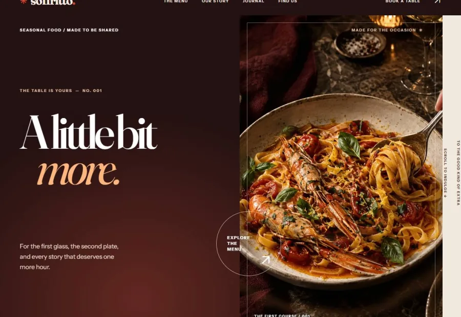
Verjus is built for seasonal tasting-menu restaurants, and its collection section is designed to read as an actual printed tasting-menu card rather than a generic product grid. The palette — warm cream paper, deep wine red, burnt caramel amber — carries that print feel through the whole site, and the layout is organized course by course, season by season, matching how a tasting menu is actually built and served.
 Open live preview ↗
Highlights
- Collection section reads as an actual printed tasting-menu card
- Warm cream paper, deep wine red, burnt caramel amber
- Course-by-course seasonal structure, not a generic dish grid
- Course/Season content type for chef-driven, rotating menus
Overview
Verjus breaks from the last several themes’ dark palettes on purpose — warm cream ‘menu card’ paper, deep wine red, and burnt caramel amber. The homepage’s structural novelty is that the collection section reads as an actual printed tasting menu, course by course, rather than a generic dish grid with photos and prices.
A Course/Season content type lets a tasting-menu restaurant rotate its printed-menu-style presentation with the actual season, matching how chef-driven restaurants really update their offering.
What's included
- Full theme source — every template, style sheet & script
- One-click demo importer (idempotent, no page builder)
- Live Customizer controls for copy, colours & content
- Translation-ready .pot file + RTL stylesheet
- HTML documentation + a CHANGELOG file
- Lifetime updates + 6 months support (renewable)
Specifications
| WordPress | 5.6 – 7.0 |
|---|---|
| PHP | 8.0 – 8.3 |
| Browsers | Chrome, Firefox, Safari, Edge (latest) |
| Layout | Fully responsive, mobile → desktop |
| Localization | Translation-ready · RTL included |
| Accessibility | Keyboard-navigable · prefers-reduced-motion |
| Page builder | Not required — native Customizer |
| License | GNU GPL v2 · single-site commercial |
Release
The complete, dated version history ships in the theme’s CHANGELOG file. Every purchase includes lifetime access to future updates.